BurnUp vs BurnDown Chart: Which Agile Chart Is Right for Your Project?
Discover the key differences between burnup and burndown charts and how they drive effective Agile project management.
Agile project management relies on clear, adaptable, and precise tools to track progress and deliver value. Among the most effective visualizations for this purpose are burnup charts and burndown charts, widely used in Scrum, Kanban, and other Agile methodologies. These charts help teams manage tasks, monitor progress, and maintain alignment with project goals. While both serve critical roles in project management and task management, they differ in their focus, structure, and application.
This blog explores the nuances of burnup vs. burndown charts, offering a detailed comparison table, practical examples, benefits, limitations, and guidance on choosing the right chart for your project. We will also examine how these tools enhance team collaboration, sprint planning, and productivity in Agile environments.
What Are Burnup and Burndown Charts?
To understand their differences, let’s first define these two tools and their roles in Agile project management.
Burndown Chart: Tracking Work Remaining
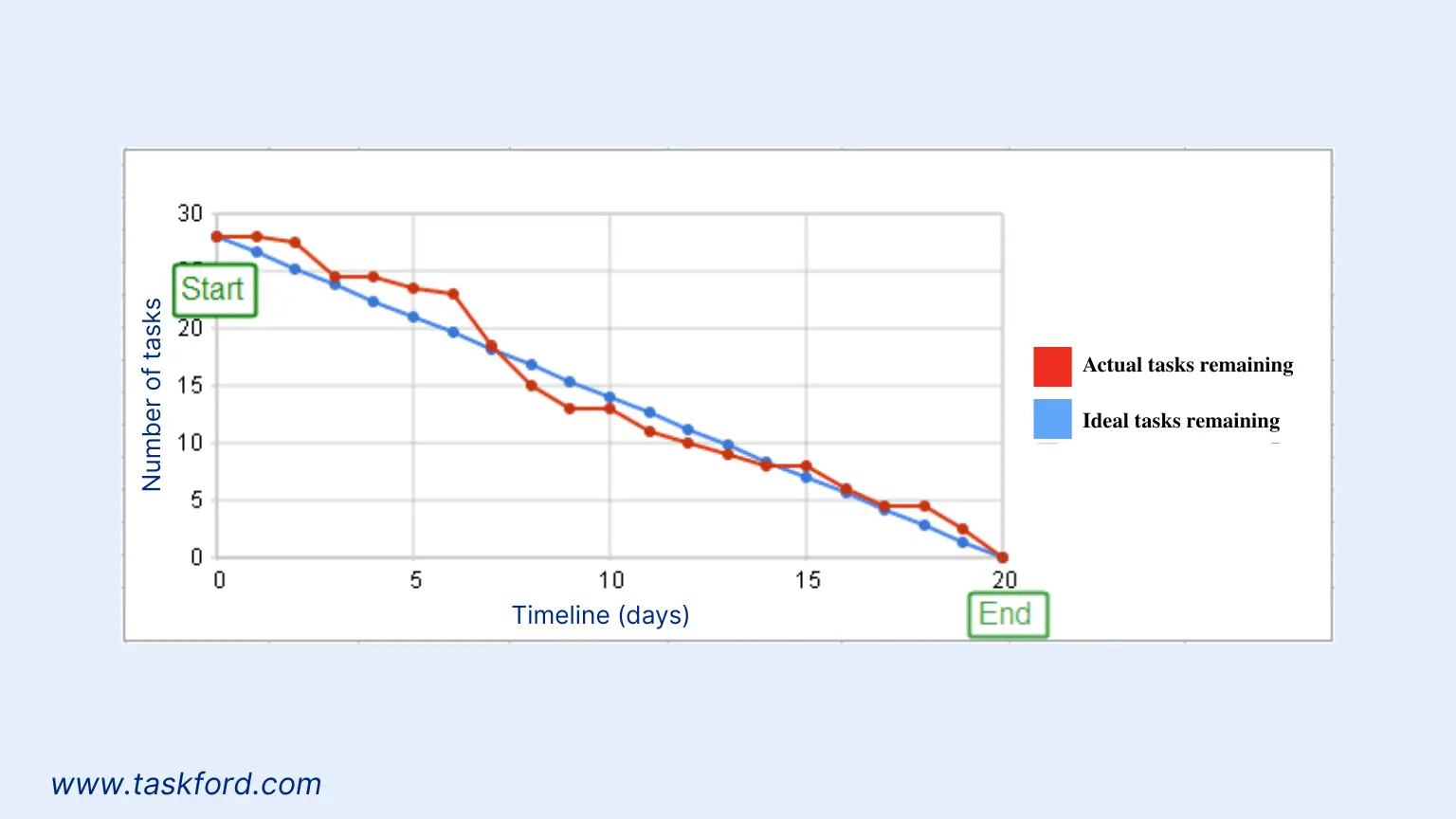
A burndown chart visualizes the amount of work remaining in a project or sprint over a set timeframe. It plots time (days, weeks, or sprints) on the horizontal X-axis and work remaining (measured in story points, hours, or tasks) on the vertical Y-axis. The goal is to see the work “burn down” to zero as tasks are completed, offering a clear indicator of whether the team is on track to meet deadlines.
The burndown chart includes two primary lines:
- Ideal Work Remaining Line: A diagonal line showing the expected rate of task completion, starting from the total work at the project’s outset and sloping to zero by the deadline.
- Actual Work Remaining Line: A line tracking real-time progress, fluctuating based on the team’s task completion rate.
Burndown charts are highly effective for sprint tracking, providing a quick snapshot of whether a team is ahead, on track, or behind schedule. They are a staple in Scrum for monitoring progress within a single sprint, typically lasting 1 to 4 weeks, or across an entire project.
(We have prepared a detailed explanation in case you want to know more about Burndown Chart)
Burnup Chart: Highlighting Work Completed
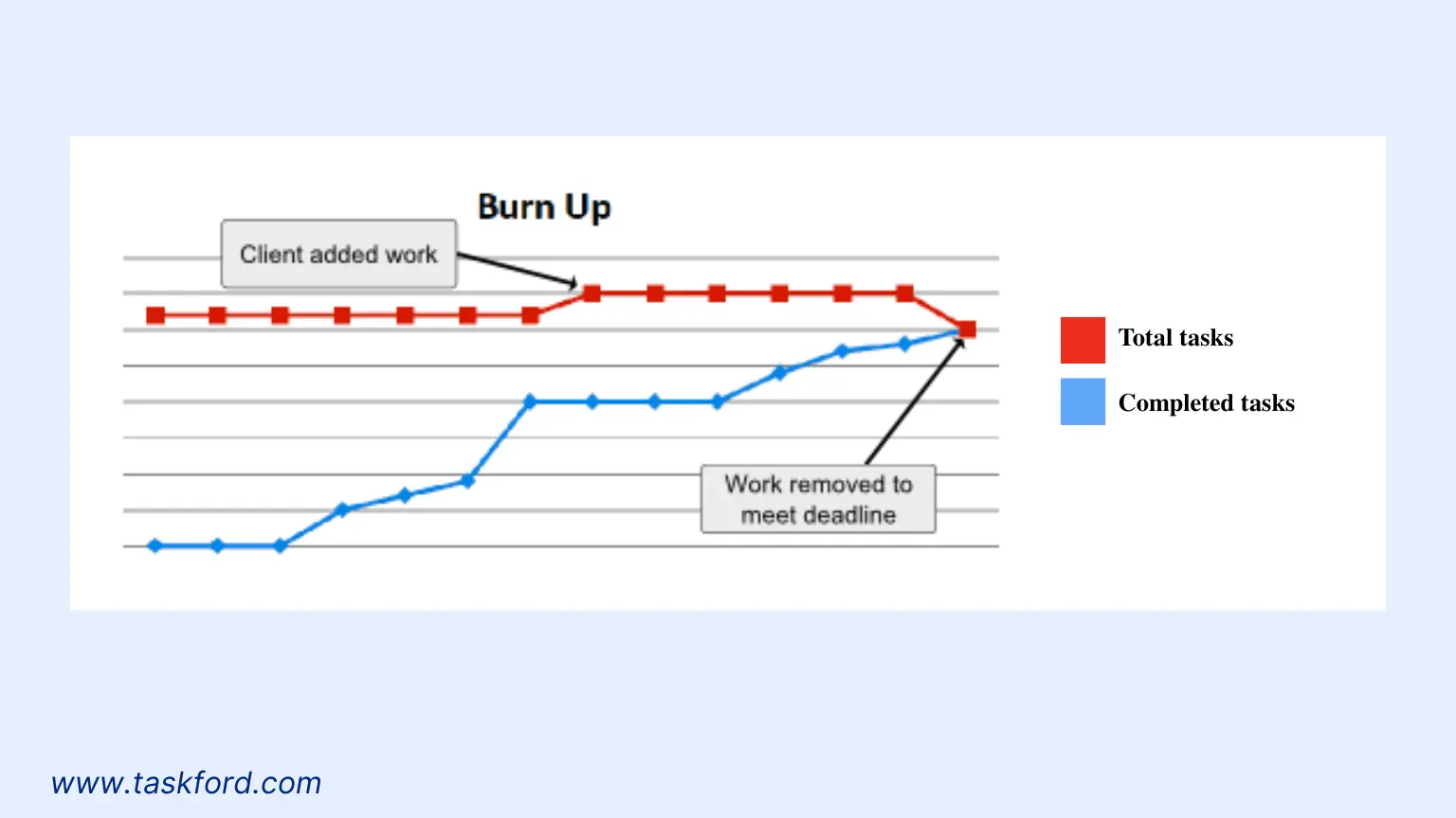
In contrast, a burnup chart focuses on the work completed over time, alongside the total project scope. Like the burndown chart, it uses time on the X-axis, but the Y-axis represents work completed (in story points, hours, or tasks) rather than work remaining. A burnup chart typically includes two lines:
- Total Scope Line: Represents the total amount of work in the project, which may increase or decrease as scope changes occur.
- Work Completed Line: Tracks cumulative work completed, rising toward the total scope as tasks are finished.
Burnup charts are ideal for projects with evolving requirements, as they clearly distinguish completed work from scope changes, making them well-suited for release planning and long-term product development.
Key Differences Between Burnup and Burndown Charts
While both charts are integral to Agile project management, they differ in focus, representation of progress, and handling of scope changes. The table below summarizes these differences, followed by a detailed explanation:
| Aspect | Burndown Chart | Burnup Chart |
|---|---|---|
| Focus | Tracks work remaining in a project or sprint. | Tracks work completed and total project scope. |
| Scope Changes | Struggles to show scope changes clearly; new tasks may distort the chart. | Clearly visualizes scope changes via an adjustable total scope line. |
| Best Use Case | Short-term sprint tracking with fixed scope (e.g., Scrum sprints). | Long-term release planning or projects with dynamic scope (e.g., product epics). |
| Motivation | Emphasizes deadlines, which may feel demotivating if progress is slow. | Highlights achievements, boosting team morale. |
| Stakeholder Value | Best for teams and Scrum Masters to monitor deadlines and identify bottlenecks. | Ideal for communicating progress and scope changes to stakeholders. |
| Complexity | Simple and straightforward to interpret. | Slightly more complex due to scope changes |
1. Focus: Remaining vs. Completed Work
Burndown charts center on the work yet to be done, offering a perspective that highlights tasks remaining to meet deadlines. If the actual work remaining line is above the ideal line, the team is behind schedule. Burnup charts, however, emphasize work completed, showcasing progress toward the total scope, which can motivate teams.
For example, in a Scrum sprint, a burndown chart might show 50 story points remaining after 5 days, signaling whether the team is on pace to meet the sprint goal. A burnup chart would instead show 30 story points completed, emphasizing progress toward an 80-story-point scope.
2. Handling Scope Changes
Burndown charts struggle to reflect scope changes clearly. Adding tasks mid-sprint causes a spike in the work remaining line, which can confuse without additional context. Burnup charts excel at visualizing scope changes, as the total scope line adjusts upward for added tasks or downward for removed tasks, clearly separating progress from scope adjustments.
In a software development project, if a client adds new features mid-release, a burnup chart’s total scope line rises (e.g., from 200 to 250 story points), while the work completed line continues to grow, providing clarity on both progress and scope.
3. Communication and Motivation
Burndown charts suit teams focused on deadlines, highlighting whether they’re on track to complete tasks by the sprint or project end. They are a key tool for Scrum Masters and project managers to manage team velocity and resolve bottlenecks. Burnup charts are better for stakeholder communication, as they emphasize achievements. The rising work completed line fosters team morale and a sense of accomplishment, especially in long-term projects.
4. Use Cases
Burndown charts are ideal for sprint burndown, tracking progress within a single sprint, or product burndown, monitoring overall project progress. They are common in Scrum for short, predictable cycles. Burnup charts are suited for release burndown or projects with frequent scope changes, such as product development or epic tracking, offering a broader view across multiple sprints.
Benefits and Limitations of Burndown Charts
Benefits
- Real-Time Visibility: Burndown charts offer an immediate view of progress, enabling teams and stakeholders to assess whether the project is on track.
- Predictability: Comparing the actual work remaining line to the ideal line helps teams forecast whether they’ll meet deadlines and adjust plans accordingly.
- Transparency: Regular updates promote team collaboration and accountability, ensuring alignment on progress and challenges.
- Simplicity: Burndown charts are straightforward to create and interpret, requiring minimal setup.
- Bottleneck Identification: A flat or upward-trending actual work line signals delays or scope creep, prompting early intervention.
Limitations
- Lack of Detail: They don’t distinguish between high- and low-priority tasks or track work in progress, as only completed tasks count.
- Scope Change Confusion: Adding or removing tasks distorts the chart, complicating interpretation without additional documentation.
- Deadline Focus: Emphasizing work remaining can demotivate teams, particularly if progress seems stalled.
Benefits and Limitations of Burnup Charts
Benefits
- Clear Scope Visualization: Burnup charts explicitly show scope changes, making it easier to communicate adjustments to stakeholders.
- Motivational Impact: By focusing on completed work, they highlight achievements, boosting team morale and engagement.
- Flexibility: They are ideal for projects with evolving requirements, such as software development or product roadmaps.
- Stakeholder Communication: Burnup charts provide a comprehensive view of progress and scope, making them effective for reporting to clients or executives.
- Long-Term Tracking: They excel at tracking progress across multiple sprints or an entire product backlog.
Limitations
- Complexity: Burnup charts can be harder to interpret, especially for teams new to Agile.
- Less Deadline Focus: Emphasizing completed work may downplay delays, requiring additional tools to monitor deadlines.
- Scope Tracking Needs: Accurate burnup charts require diligent tracking of scope changes, which can be labor-intensive.
Practical Examples: Burnup vs. Burndown in Action
Let’s explore two scenarios to illustrate burnup and burndown charts in a software development project.
Scenario 1: Burndown Chart
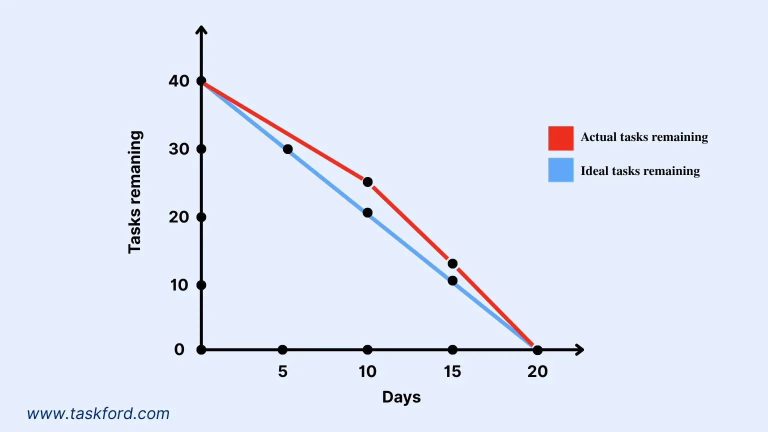
Imagine a team developing an e-commerce website over a four-week sprint with 40 story points of work, including tasks like designing the homepage, integrating payment gateways, and testing user flows. They create a sprint burndown chart with:
- X-Axis: 20 working days.
- Y-Axis: 40 story points.
- Ideal Line: A straight line from 40 story points on day 1 to 0 on day 20.
By day 10, the team has completed 15 story points, but the actual work line is above the ideal line, indicating slower progress. Analytics reveal that testing tasks are taking longer than estimated. The team reallocates resources to testing and adjusts priorities, bringing the actual line closer to the ideal line by day 15. By the sprint’s end, the project is completed on time, thanks to the burndown chart’s insights.
Scenario 2: Burnup Chart
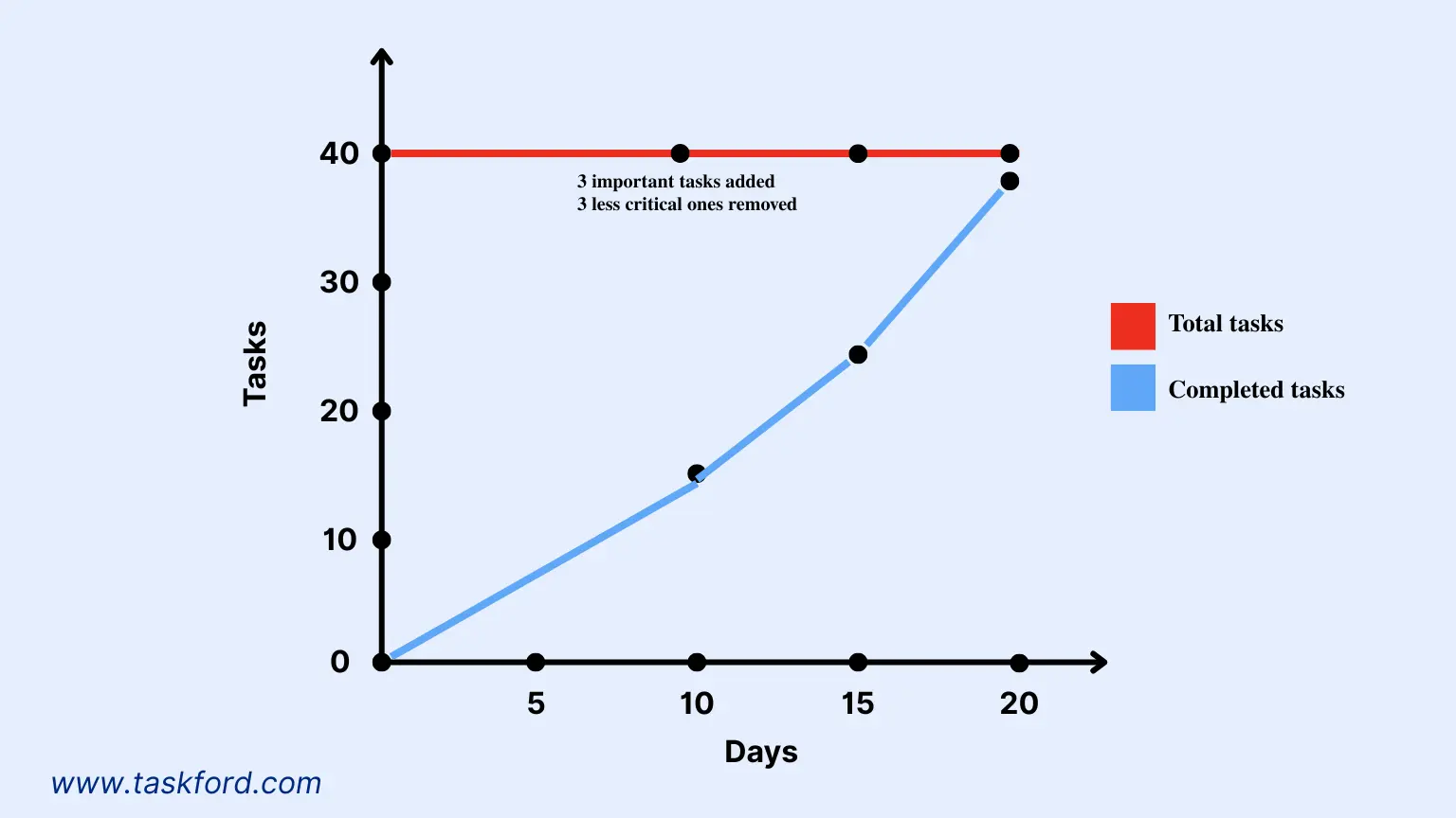
A team develops an e-commerce website in a four-week sprint with 40 story points for tasks like homepage design, payment gateway integration, and user flow testing. They use a burnup chart for project management and task management.
- X-Axis: 20 working days.
- Y-Axis: 0 to 40 story points.
- Total Scope Line: Starts at 40 story points, adjustable for scope changes.
- Work Completed Line: Begins at 0, rising as tasks are completed.
By day 10, the team completes 15 story points, but progress lags due to complex testing tasks. The client adds a 3-story-point product recommendation feature, raising the total scope to 40 story points (after removing 3 less critical story points to accommodate). The team shifts resources to testing, reaching 25 story points by day 15. By day 20, they complete 37 story points. The burnup chart shows 37 of 40 story points done, enabling the team leader to plan the remaining work for the next sprint, supporting team collaboration and sprint planning.
Choosing Between Burnup and Burndown Charts
Selecting the right chart depends on your project’s needs, team dynamics, and stakeholder expectations. Consider these guidelines:
1. Use a Burndown Chart When:
- Managing a Scrum sprint with a fixed scope and clear deadlines.
- The team needs a simple, deadline-focused tool to stay on track.
- You aim to identify delays or bottlenecks quickly in short iterations.
- The project has minimal scope changes, focusing on a predefined sprint backlog.
2. Use a Burnup Chart When:
- The project involves frequent scope changes, such as in product development or epic tracking.
- You want to highlight progress to motivate the team by showcasing completed work.
- Communicating progress and scope changes to stakeholders is a priority.
- Tracking long-term progress across multiple sprints or a release cycle is needed.
For projects with both fixed deadlines and evolving scopes, using both charts can provide a comprehensive view. For instance, a sprint burndown chart tracks daily progress within a sprint, while a release burnup chart monitors the project’s broader trajectory.
Best Practices for Using Burnup and Burndown Charts
To maximize these tools’ effectiveness in project management and task management, follow these best practices:
- Update Regularly: Update the actual work line daily for burndown charts or per sprint for burnup charts to ensure accuracy.
- Use Consistent Metrics: Stick to one unit of measurement, such as story points, hours, or tasks, to avoid confusion.
- Engage the Team: Share charts during daily stand-ups or sprint reviews to promote transparency and team collaboration.
- Analyze Trends: Identify patterns in the actual work line to address recurring issues, such as task underestimation or resource constraints.
- Combine with Other Tools: Pair charts with velocity tracking, retrospectives, or Kanban boards for deeper insights into team performance.
- Educate Stakeholders: Ensure stakeholders understand how to interpret charts, particularly burnup charts with scope changes, to avoid misinterpretation.
Conclusion: Burnup vs. Burndown for Agile Success
Both burnup and burndown charts are indispensable for Agile project management, offering distinct perspectives on progress and scope. Burndown charts excel at keeping teams focused on deadlines and identifying delays, making them ideal for sprint tracking and fixed-scope projects. Burnup charts provide clarity on scope changes and highlight achievements, perfect for long-term product development and stakeholder communication.
Whether you’re a team leader or team member, leveraging these charts can enhance task management, boost team collaboration, and drive productivity. Platforms like TaskFord make it easy to implement these charts, ensuring alignment and timely delivery. Experiment with both in your next project to find the ideal approach for your Agile journey.
Learn more
- Agile Project Management - The Basics For Beginners
- Agile Project Management Sprint Cycle - From Planning to Retrospective
- Real-World Agile Project Management with Scrum - Lessons from the TaskFord Team

Making work simpler,
smarter, and more connected
Join our waitlist and be notified first.


Subscribe for Expert Tips
Unlock expert insights and stay ahead with TaskFord. Sign up now to receive valuable tips, strategies, and updates directly in your inbox.